
AAKASH BYJUS
Context
Clarity is the currency of commerce, Without knowing our offerings, the customer's purchase remains uncertain.
BYJUs acquired Aakash Institutions in 2019, along with the acquisition came an online platform with a new set of K-12 user-base to train students for the JEE and NEET entrance exams.
This 8 min read tells you about my work on surfacing our offerings in a unique way during the overhaul of the platform.

Project details
The BYJUites

Sreejesh P
Principal product designer

Tanzeel (me)
Product designer

Anchal chuhan
Product designer

Deepabali Biswas
UX designer resource
My Role
Associate UX strategist:
-
Contribute with new perspectives and validate the strategy proposed by the principal product designer.
Define:
-
Proposing current journey maps
-
Emphasize with the user along the team
-
Identify problem spaces and forge problem statements
Ideate:
-
Approach/direction level concept ideation
-
Hero concept visualisation
-
Future state journey map
The deliverables
-
Wireframe with clear ideas of behaviour and interaction
-
Decision-driving user stories
-
Foundational psychological theories supporting the concept ideas
Timeline
1 month
(Dec 2020 - Jan 2020)
The challenge

Unaware users
With focus groups & sales team, we found almost 60% of the new users didn't know about the platform's key offerings.

Engagement
Drilling down the data collected from the app, we deduced that for a first-time user, the engagement was only 20%.

Opportunity to improve experience
Thanks to In-app feedback & play store reviews, we were able to deduce users found it difficult to use especially struggling with the navigation

Our approach and strategy

Problem spaces
“Target user” needs to “User needs” so that “Outcome / goal”
Maya is a class 11th student who wants to solidify her physics basics so that she can easily understand advanced concepts and methods that are about to be taught in her college
Dikshith is a class 12th student who is looking for more and more resources to practice and prepare for his upcoming NEET exam so that he is more confident to face the examination
My key moments during ideation
While most of our brainstorming with ‘How might we’ was directed at the platform as a whole. there were some key moments where I came up with methodologies that helped the team to solidify the platform features to be surfaced on home screen.

The ‘Why’ map
I found the project in a phase where insights were being collected on sticky notes within a Fig Jam file, with plans to organize them through affinity mapping. Drawing inspiration from the five whys method, I structured the insights in a manner that each group of insights could serve as a potential answer to a "why" question posed to the user. These group headings, in turn, could lead to further "why" questions until reaching the ultimate why: "To secure a good rank in JEE/NEET."
For instance, one group might address the why "So that I can be prepared for the exam," an insight we came up with was "I need exercises to manage my mental health."

The priority chart - A reminder to the duties of a product designer

To uncover our offerings and features using various psychological theories, the team explored multiple approaches. Consequently, I devised a priority map. We engaged some of our existing users, presenting them with our key features and requesting them to position them on a chart based on Effort vs. Helpfulness (later referred to as Outcome for our convenience).
The outcome revealed that we could identify the features most valuable to the users.
However, there was some pushback. As product designers, we're obligated to address both user needs and business objectives. The project managers emphasized the importance of highlighting live classes, as they generate leads for potential app customers. Therefore, they instructed us to prioritize surfacing live classes in the initial interface.
Noteworthy solution directions

Concept 1
Starting with user-interest-driven features has its benefits, but it can also lead to disinterest if topics aren't appealing. Moreover, the abundance of choices may overwhelm users compared to a more focused search method.
Concept 2
The approach of emphasizing user needs over app features provides a strong starting point for users and encourages exploration of additional features. Combining the "Ask a Doubt" feature with the search bar offers versatility in content delivery based on user queries. However, there is a risk that users may not fully explore the app if key features are buried in later folds, and there are concerns about potential user disinterest in the textbook-based Q&A module. Additionally, the distinction between the "Ask a Doubt" feature and search functionality may cause confusion for users.
This is how we solved it !


-
Users across the segment (K-12) are familiar with subject names to get started with the platform. (Mere-exposure effect) The subject-first, feature-second strategy encourages the user to learn more about the app as they use it.
-
Using a friendly tone to application radiates a positive reach out to the application
Motion Attracts Attention.
-
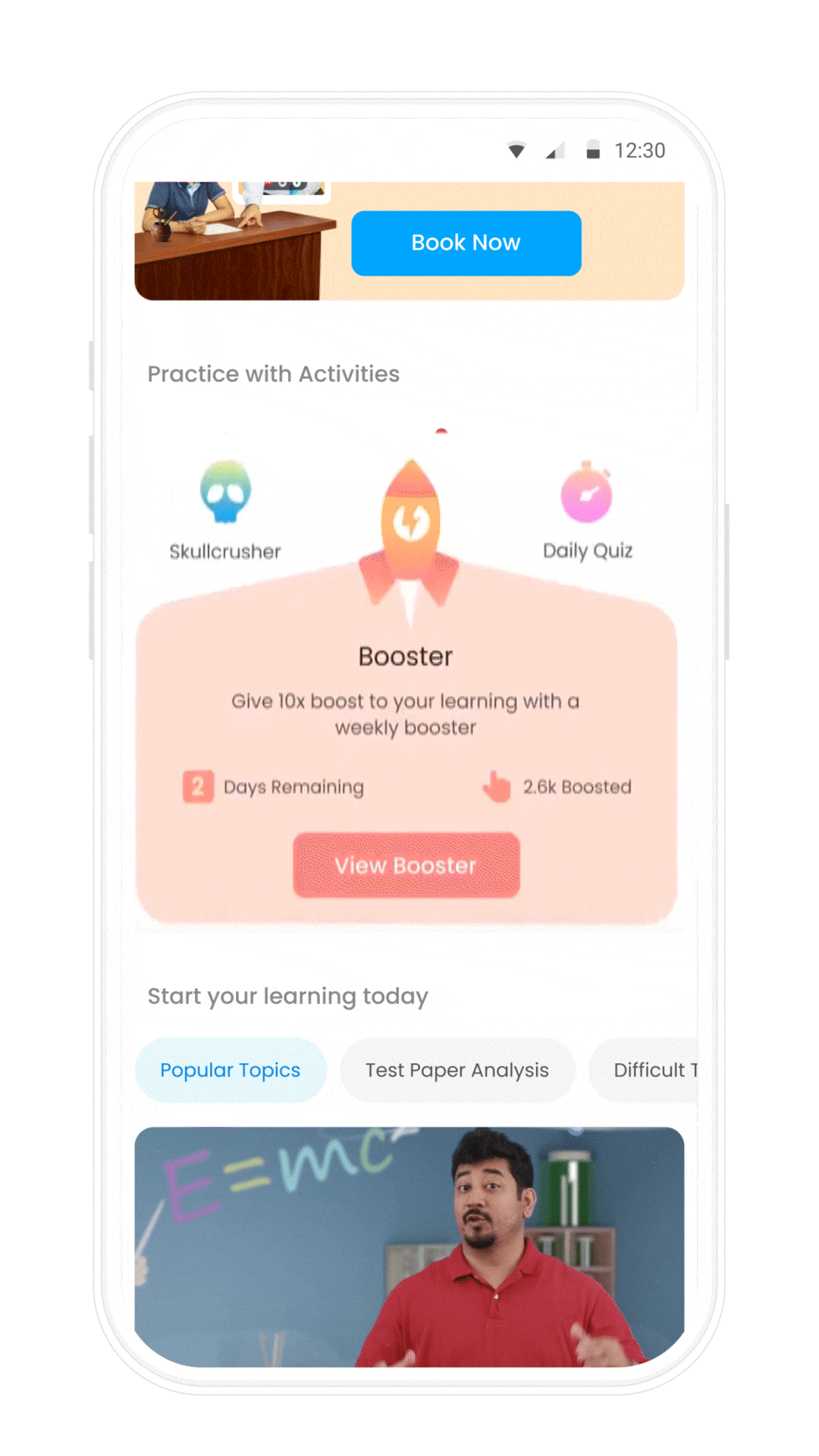
The 3 valuable and unique features of the platform were Booster, Skullcrushers and daily quiz
-
These activities were specifically designed and optimised to create prolonged user engagement resulting in a higher retention rate.
-
Attractive custom animations catch the eye of the user prompting them to check out the features.

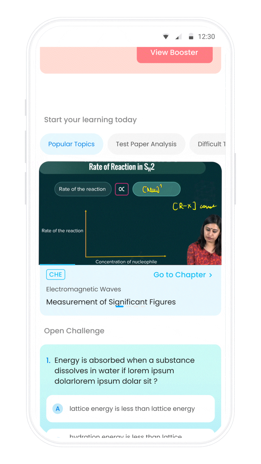
Content Consumption over Content Exploration
-
While the focus was on finding the right content in the earlier version, We wanted to test Content consumption
-
When a recommended video is in view, the video starts playing (on mute),
Content consuming experience (CCE)
The concept prioritises consumption of the content itself over finding the right content.
The advantage is that for a FWU (First week user) we can communicate “How we teach” along with what concept we teach
CCE is whole experience, not just videos!
-
One of the key insights we deduced from the data is users rarely open tests, mockup papers and previous year papers.
-
Understandably as a designer, it's simple, People hesitate to put effort especially when it's a new app they are trying out (Limited Attention Span.)
The concept shows a set of 5 easily solvable questions. Once answered, the result of the choice is shown along with an explanation. This concept takes out 2 birds in one stone
-
We can communicate “How we teach”, Correct the user if they are wrong or in case correct, explain why is it so.
-
We break the ice and make the user comfortable with answering questions (Tests, Mock exams, previous year papers etc...)

Impact
-
23% increase in conversion and whopping 17% retention (D1-D7)
-
Initial feedback from the Play Store indicates a soothing user experience


Closing thoughts
Key learnings
-
As a product designer for an organization, it's important not only to address user needs but also to consider solutions that benefit both users and the business.
-
UX methodologies may vary depending on the problem being tackled and the project at hand. While it's helpful to be familiar with popular methodologies, creating our approaches can lead to better outcomes and increased efficiency.